
UX Research, Interactive Design, Prototyping, Web Development
Adobe XD, WordPress, Elementor
Desktop, Tablet, Mobile
Due to a limited timeline, I had to move into conceptualizing and designing the updates within a few weeks.
Working as the sole Designer for this project, I immediately had the general idea of a split screen website design in my mind the entire time, I knew that was how I wanted to visually “split” the company and the different services. So I started with some research to better understand how a split screen landing page could look and what information would be the most important to leave on the landing page.
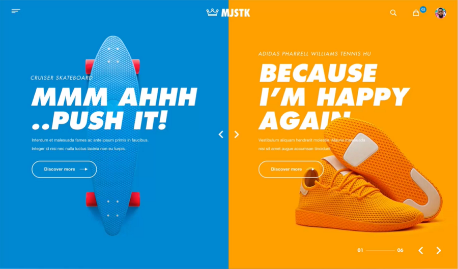
I quickly found this split screen design as inspiration, pulling 3 key elements into my landing page redesign:
- Bold colours separating the two sections
- Same "Call to Action" button style on both sides
- Large header text as the primary focus
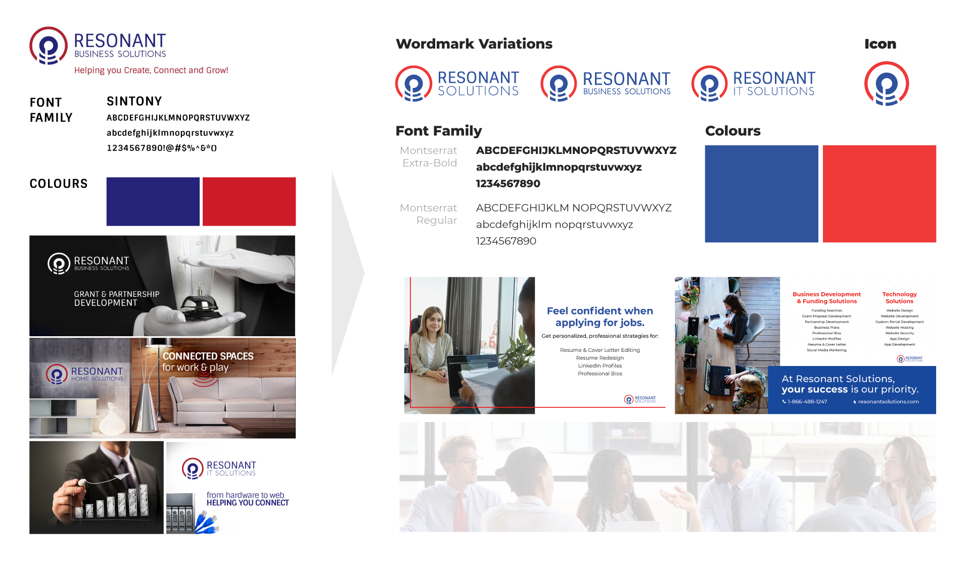
Updated to a consistent and modern font: Montserrat
Updated the red and blue colours to bolder and brighter tones that look better with colour overlays on images
Updated the stock images to have a modern approach, focusing on humans and emotional responses in the photos
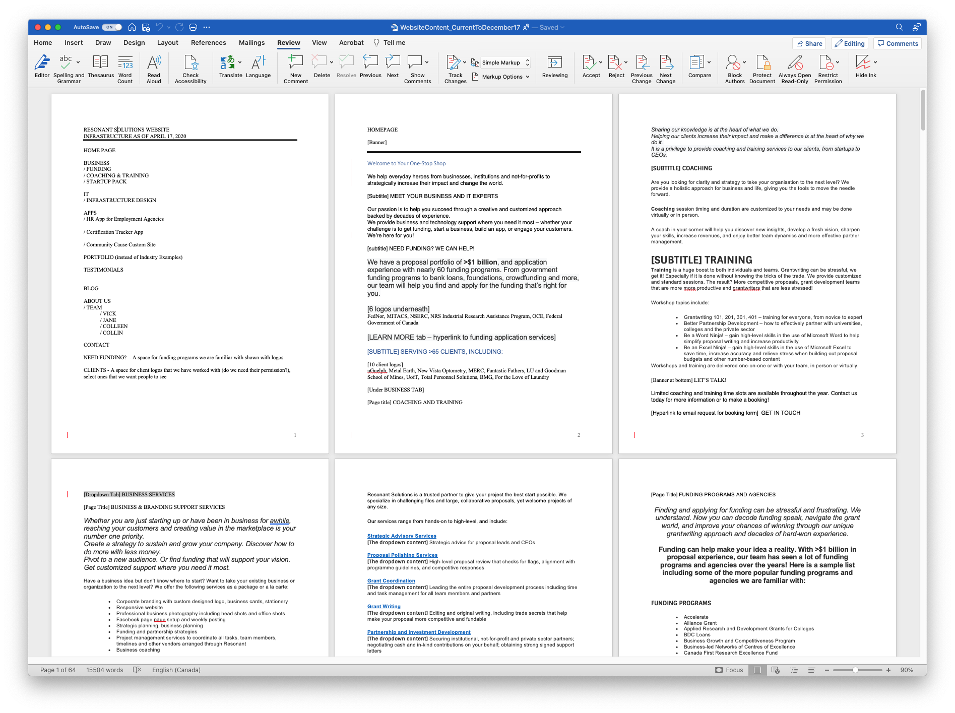
I worked closely with a copywriter to edit the existing website copy down and ensure there was a marketing spin on the content. I initiated the changes to sentences to focus on the value add to the customer and less on the company’s experience or expertise. Basically, removing all “I’ and “we” statements and restructuring sentences to have the value proposition first, to grab the attention of the audience.
This was a really hard ask and adjustment based on the President’s wants and needs to express the expertise, so I would say we only got about 50% there in regards to a true editing of the wording, however, we made substantial headway in reducing the website word count by up to 65%.
For context, we were originally working in a word document that was 64 pages.
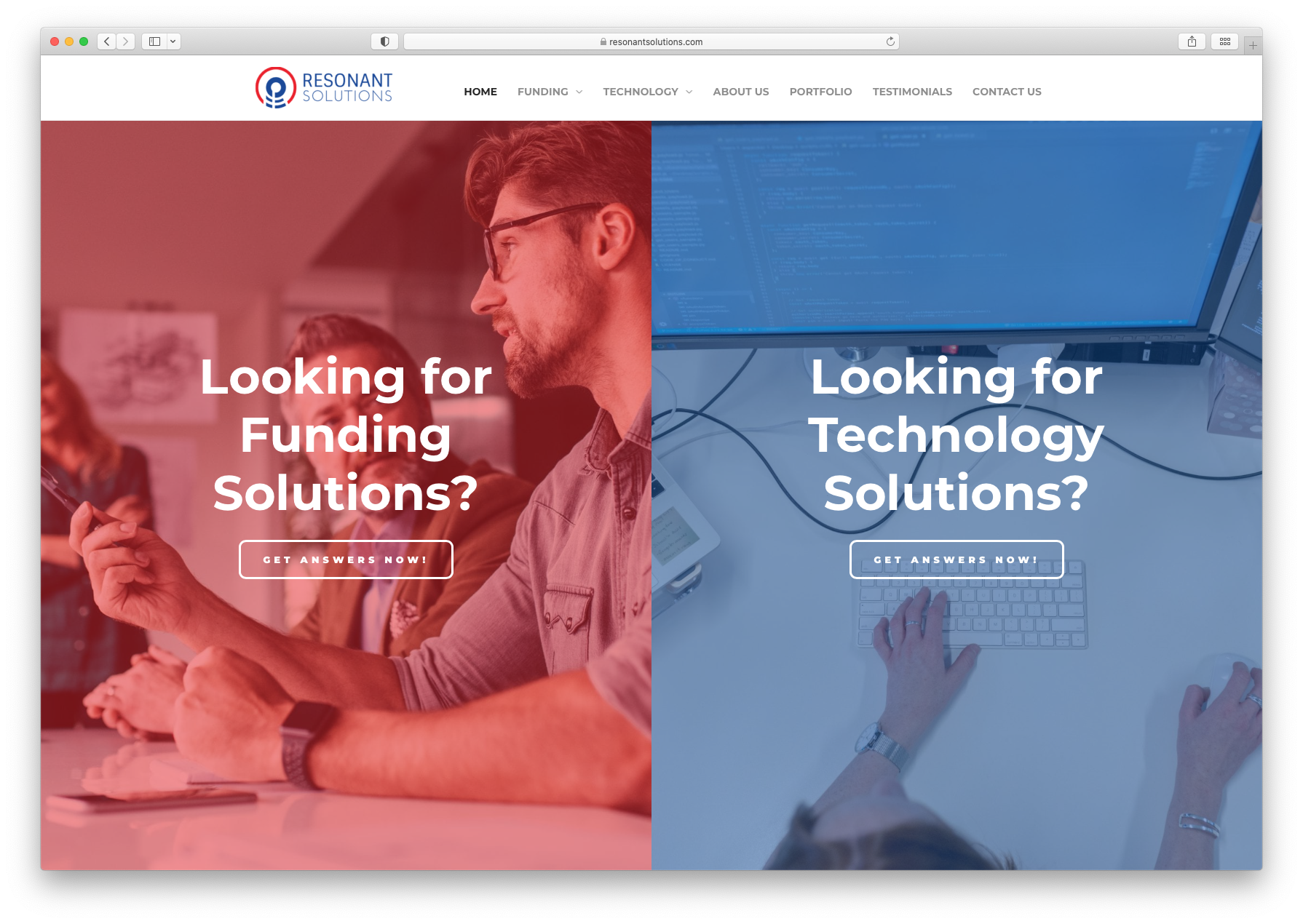
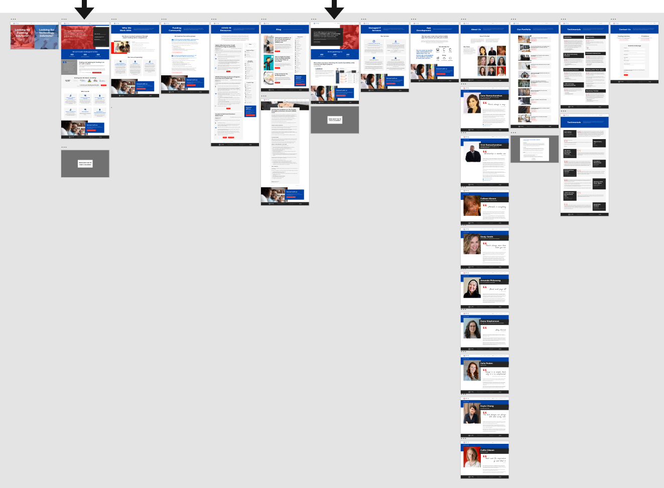
Updated the imagery and design for immediate recognition and a clear path for the user.
Organized the necessary information into new pages by combining similar information, using clear and direct headers, big visuals, and consistent Call to Action sections.
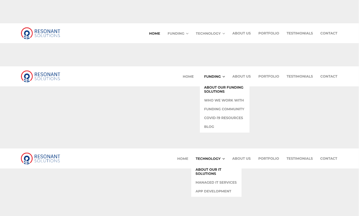
Designed and developed unique navigation bars for different pages to guide the user once on the funding or technology solutions side.
The final design of the Resonant Solutions website is a
result of a total of 2 months of work, incorporating research and design thinking to improve the user experience. Not only did the statistics show an improvement of interactions on the website, the follow through from those users increased with a 23% increase of Funding Discovery Calls booked from the website.
By focusing the copy to the most important pieces of information and the pain points, along with an modernized brand identity, Resonant Solutions was able to define their service offering to their newly defined target market and increase the number of customers through the website's organic reach. The design solutions solved the initial user confusion and helped to better reflect the business goals and voice.